
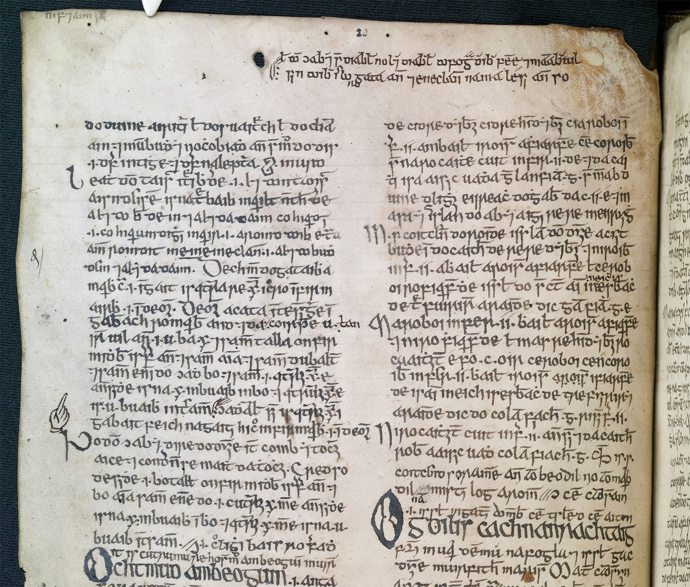
Ornamental Reader's Aids
A Unique Insight Into Illustrations
Scribes of Irish manuscripts used a variety of symbols to assist readers by clarifying the layout of text on a page or by drawing attention to significant textual and codicologial matters. While many of these take the form of standard critical signs found in other manuscript traditions, Irish scribes also employed capricious or ornamental designs which are worthy of further study. As well as being of possible diagnostic significance for the identification of scribal hands or schools, they can offer a unique insight into aspects of the material and intellectual culture of medieval and early modern Ireland.
Extracolumnar Run-over Symbols
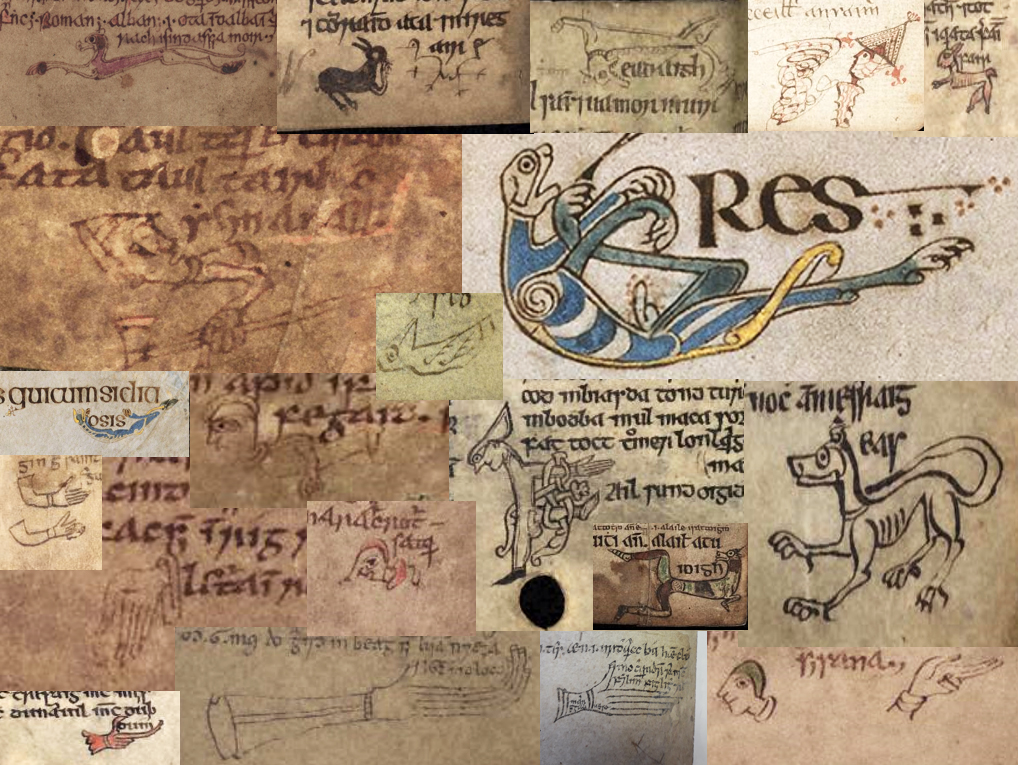
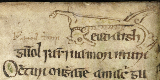
Extracolumnar symbols are generally located in the lower margins of manuscripts. They were used by scribes to mark the continuation of text from the previous line so that they could begin a new sentence or section on the next column or page (fig. 1). Some scribes made full use of the space available in the margins to create an array of inventive and colourful symbols in abstract, zoomorphic and anthropomorphic designs, often mirroring the style of decoration used in illuminated letters and borders elsewhere in the manuscript.
Abstract:
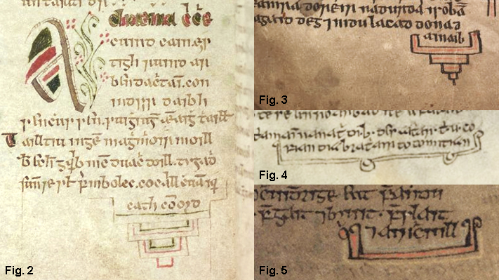
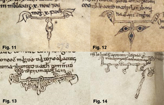
Simple abstract designs such as rectangular brackets and inverted pyramids, which required minimal effort and artistic ability, are the most common types of extracolumnar run-over symbols. Scribes sometimes added embellishments, such as colour (figs 2, 3) and terminals or pendants in the shape of scrolls (figs 4, 5),
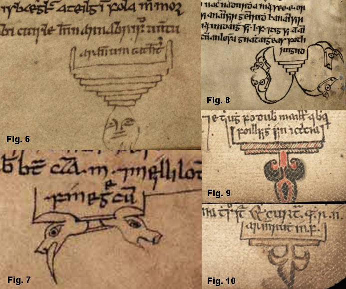
anthropomorphic or zoomorphic heads (figs 6-8), fleur di lis patterns (figs 9, 10)
abstract (figs 11, 12) or interlace (figs 13, 14) designs.
Zoomorphic:
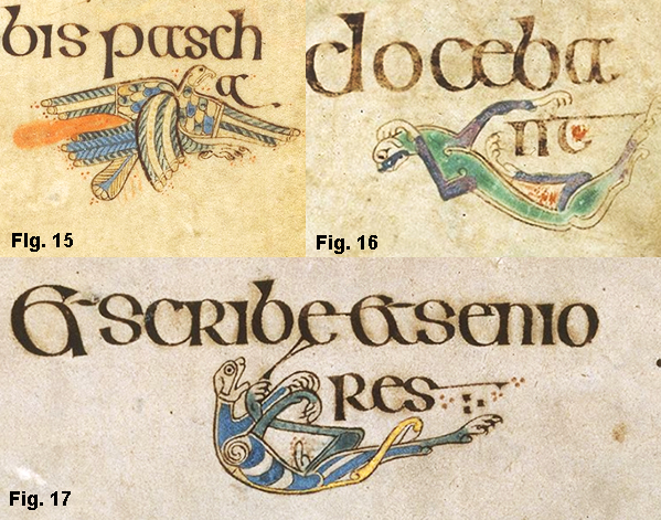
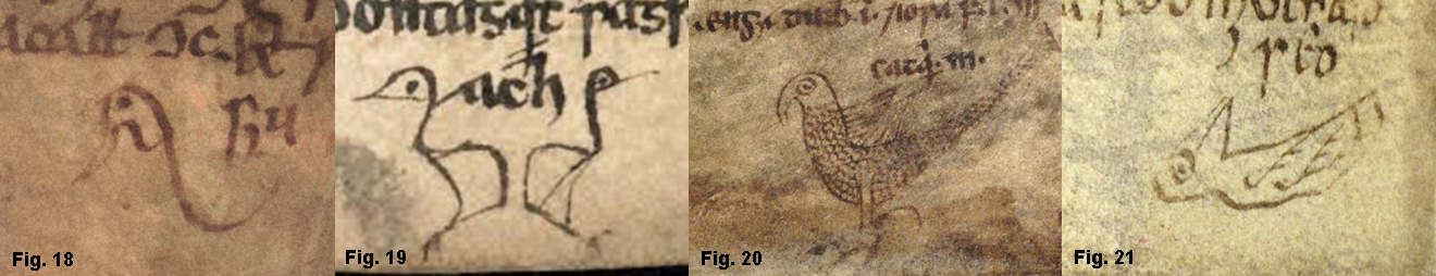
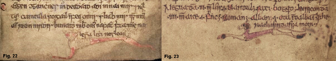
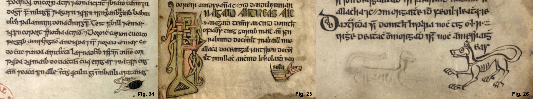
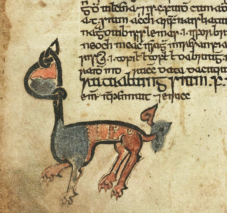
These take the form of both real animals and imaginary creatures such as dragons and hybrid designs. Some of the earliest and most intricate examples are found in the Book of Kells, where colourful symbols in the shape of birds (fig. 15), cats (fig. 16) and dogs (fig. 17) can be found. Over time, zoomorphic designs tend to become simpler and more abstract in style, perhaps reflecting a reduction in the artistic and material resources available to scribes and their patrons. The selection of zoomorphic symbols illustrated below spans several centuries and depicts both real and imaginary animals:
birds (figs 18-21);
cats (figs 22, 23);
dogs (figs 24-26), in fig. 24, a scribe has ingeniously used a small hole in the vellum as the body and extended tail of a dog-shaped symbol,
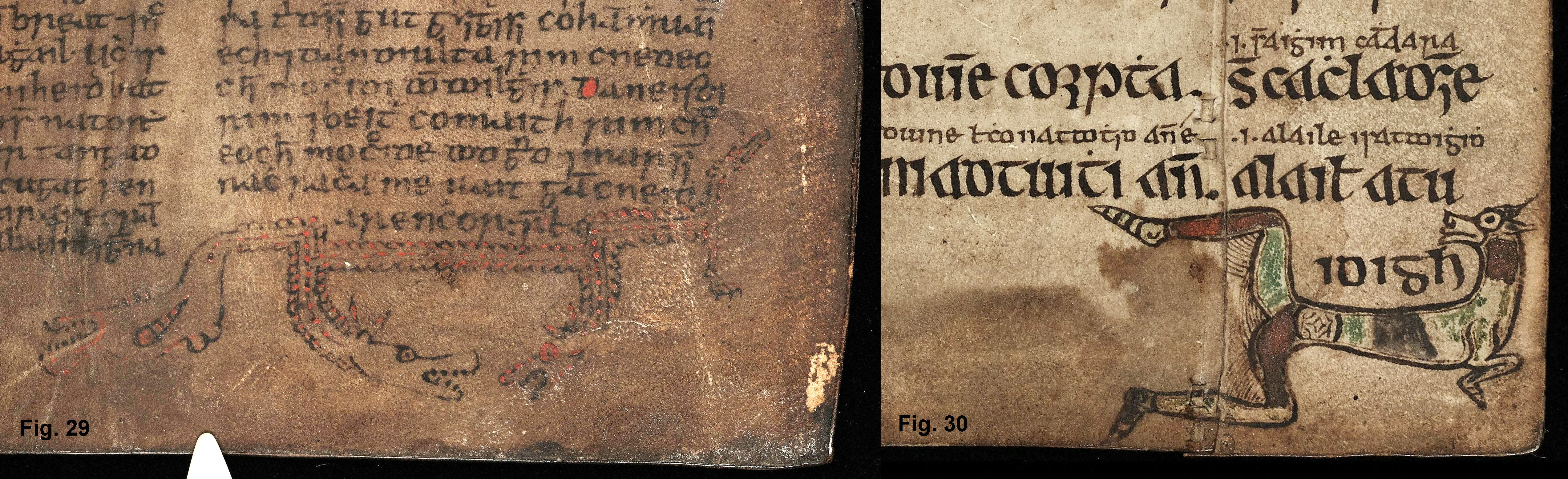
hares (figs 27, 28);
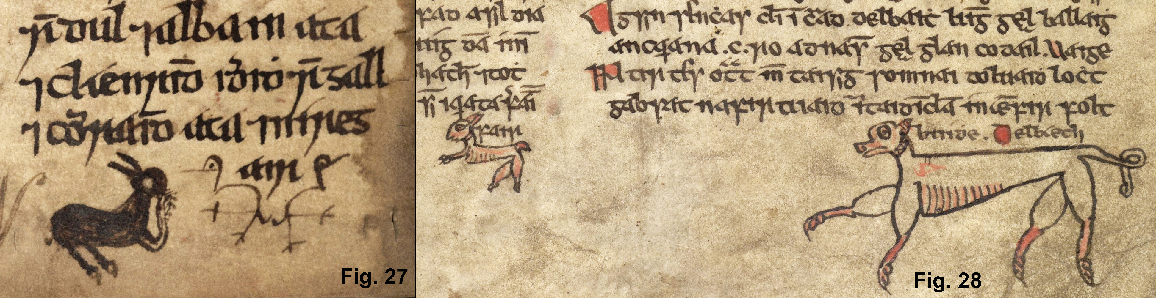
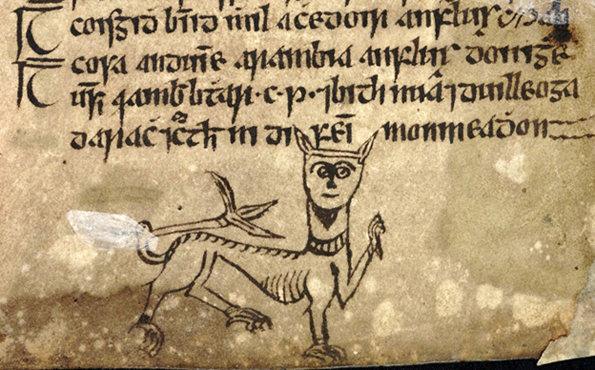
imaginary/hybrid (figs 29, 30).
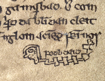
Anthropomorphic:
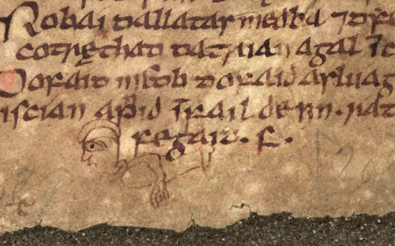
While the Book of Kells contains a variety of zoomorphic symbols marking both extracolumnar and intracolumnar text, no anthropomorphic images are used in this context. Our earliest and richest source for this type is the Book of Leinster, while only a relatively small number is found in later manuscripts. Some anthropomorphic symbols depict the complete human form (figs 31, 32),
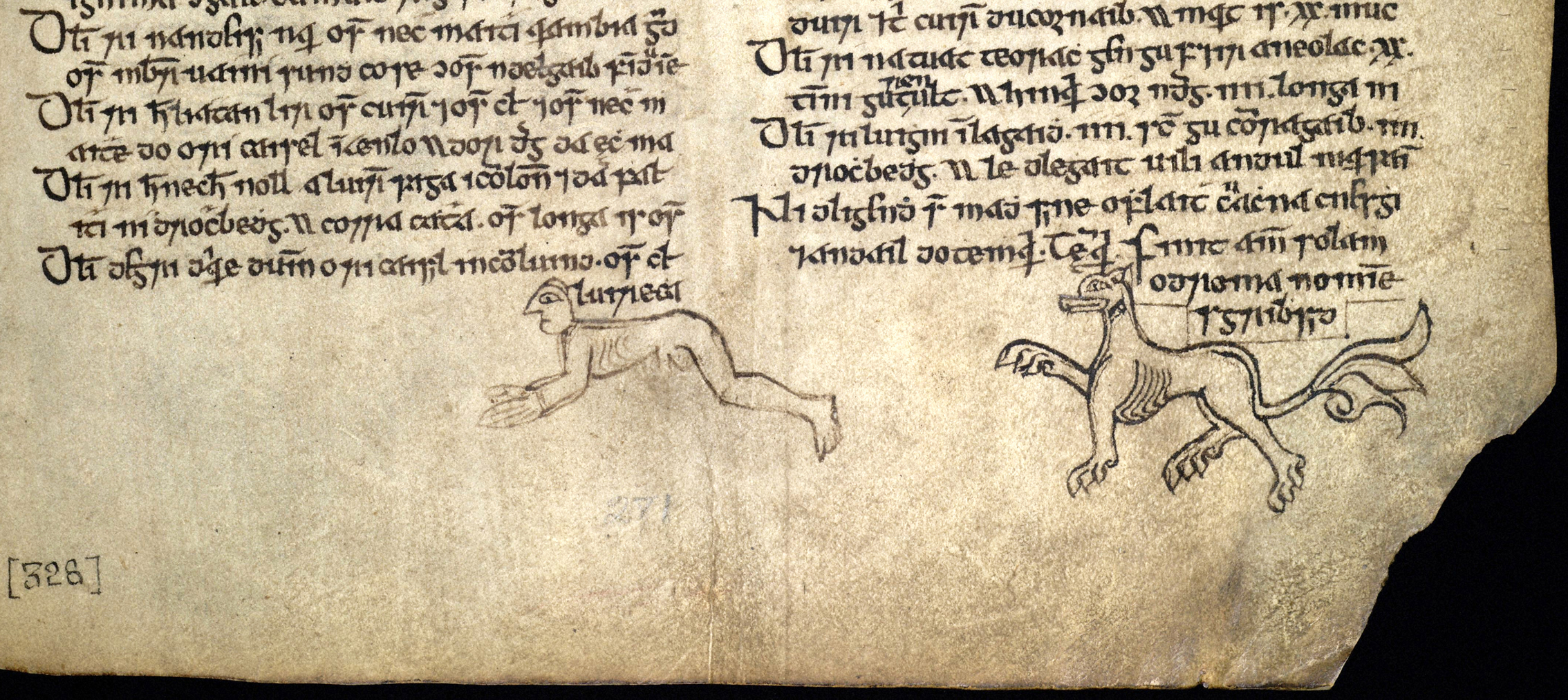
or curious hybrid formations (fig. 33).
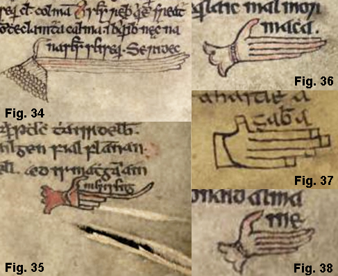
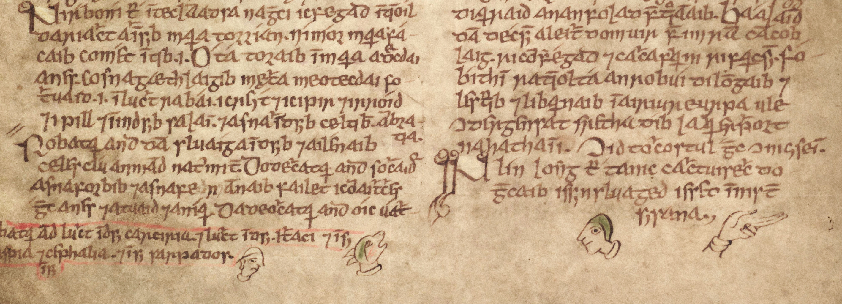
The vast majority, however, take the form of disembodied hands (figs 34-38),
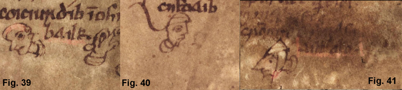
heads (figs 39-41)
or a combination of both (fig. 42).
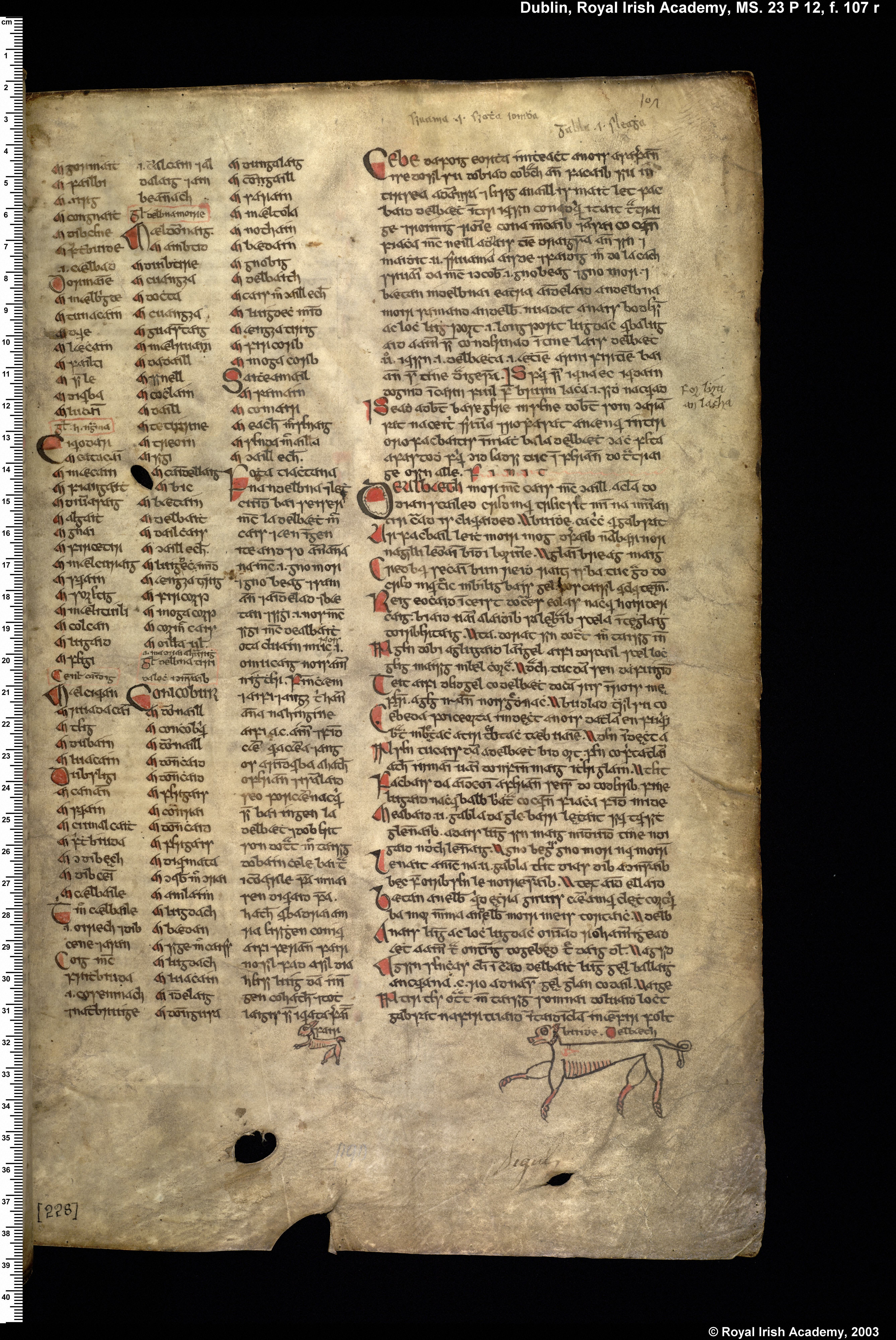
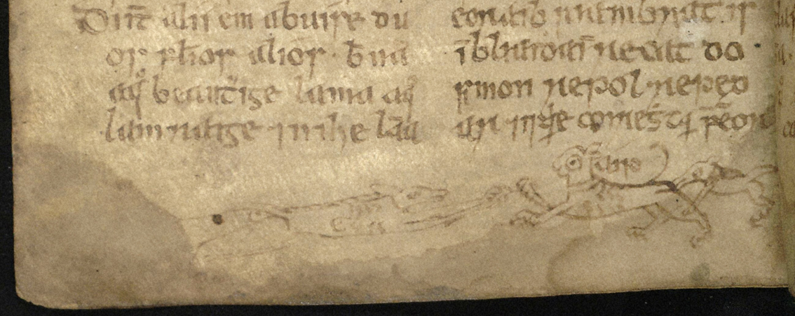
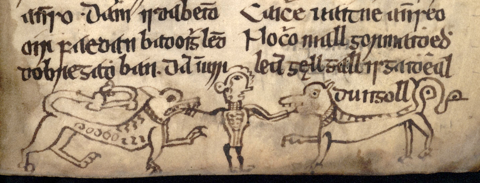
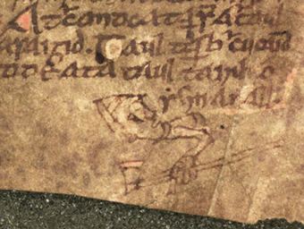
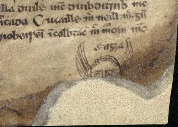
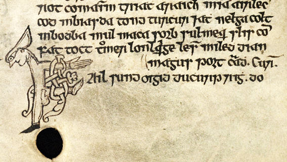
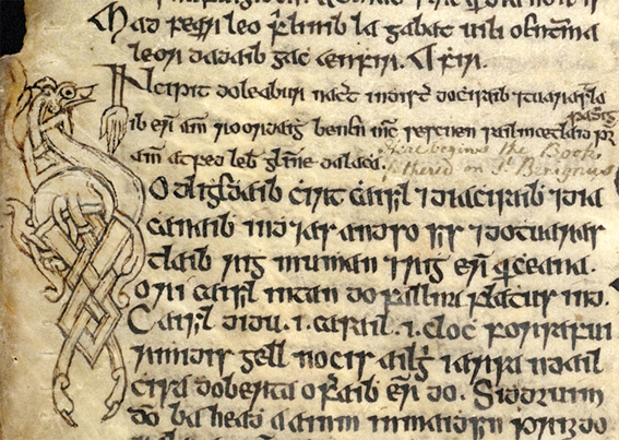
Large figurative images can only be produced where a scribe has adequate space in which to work and some scribes exploited marginal space fully by adding extra images, sometimes mixing zoomorphic and anthropomorphic designs to create extended symbols. Striking examples of this practice can be seen in NLI G 2/3, where the scribe, Ádhamh Ó Cianáin, has invested considerable artistic effort and resources in decorating the manuscript for his own personal use. In NLI G 2, a zoomorphic image (fig. 43) has been extended by the addition of two dogs attacking it at each end. In NLI G 3, a dog-shaped image has similarly been extended by the addition of two extra figures (fig. 44), creating a symbol which takes up almost the whole lower margin.
Text run-overs and symbols are less common in the upper margins of manuscripts. An example can be seen in NLI G 2 (fig. 45), where the text is marked by the figure of an upside-down dog, the orientation perhaps reflecting the unusual location of both text and symbol.
Anthropomorphic images can be drawn on as a source of information about aspects of material culture such as clothing and weaponry. A figure in the Book of Leinster, for example, depicts a type of helmet and an axe (fig. 46),
while an incomplete symbol in the Book of Uí Maine (fig. 47) takes the form of the upper part of a man’s head wearing a helmet, the wings of which enclose the text run-over.
The hand-shaped symbols in the Book of Ballymote (figs 34-38 above) are of particular interest in that, although they are the work of various scribes, each hand is stylistically unique and is depicted as wearing what appears to be an ornately cuffed glove.
The small human heads in the Book of Leinster (figs 39-41 above) are of similar interest, as they illustrate a selection of headdresses, collars, hairstyles and beards, as well as an array of rather dismal facial expressions.
Intracolumnar Run-over Symbols
Run-over symbols are also used to mark text carried above the line within columns, in which case they perform an essential function by clarifying the layout of text on the page while simultaneously acting as a space-saving device. Such symbols are generally referred to in modern scholarship as ceann fa eite ‘head under wing’ symbols, although there appears to be no contemporary evidence that the scribes themselves referred to them in this way. In contrast to the extracolumnar images illustrated above, the size of intracolumnar symbols is constrained by their interlinear context and scribes generally employed a relatively small number of easily-executed stock designs, as illustrated on the CODECS database: https://codecs.vanhamel.nl/Ceann_faoi_eite.
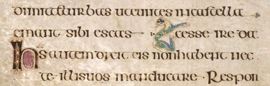
Sometimes scribes employed more ornate or distinctive ceann fa eite symbols. The most ornate abstract and zoomorphic designs are found throughout the Book of Kells. On f. 71v (fig. 48), for example, the scribe has carried the text cesse ire da (Mat. 14:16) onto the line above to fill a blank space and has flagged this with a cat-shaped symbol.
A distinctive symbol in the form of four or five dots is used throughout NLI G 2/3, where it also functions as a line filler (fig. 49).
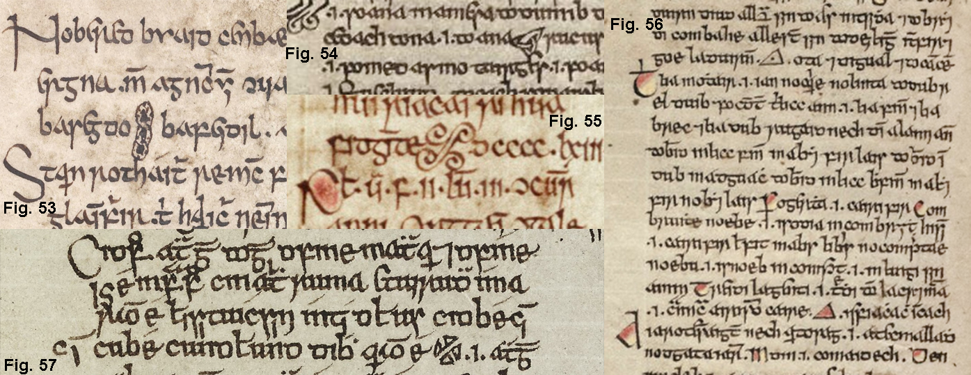
Other designs occur sporadically: hands (fig. 50), faces (fig. 51), crosses (fig. 52),
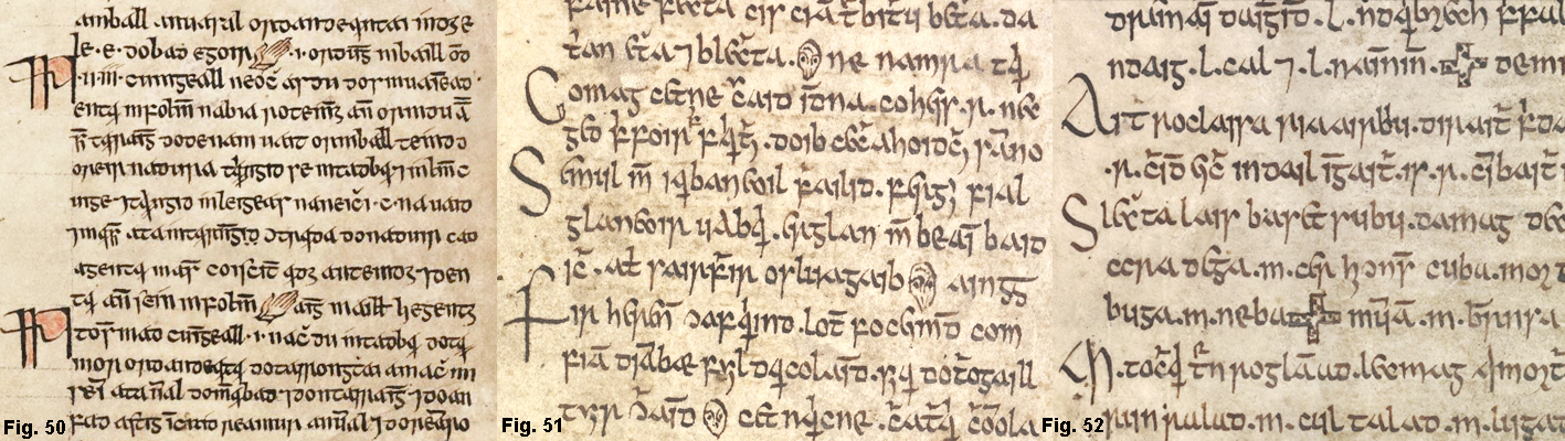
interlace (fig. 53), trefoil (fig. 54), quatrefoil (fig. 55), triangle (fig. 56) and abstract (fig. 57).
Integrated Run-over Symbols
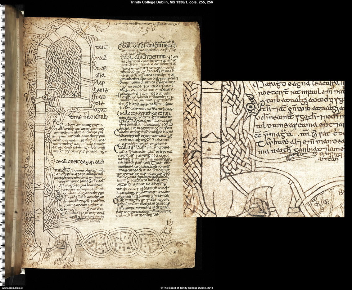
Run-over symbols are sometimes integrated within ornamental letters. In TCD 1336/1 (H 3. 17), a capital A (fig. 58) forms the head of a large zoomorphic image, the body of which functions as a run-over symbol.
A particularly creative example can be seen elsewhere in the same manuscript, where a small, serpent-like creature (fig. 59) emerges from the bottom of the stem of a magnificent capital A marking the beginning of a text. It would be easy for the reader to overlook the functional role of this minor decorative element within the letter, which must have required meticulous planning and execution. The incorporation of the device within a letter form may also have been a way of overcoming the particular constraints of space associated with marking intracolumnar text run-over.
In the Book of Ballymote, the top cross-stroke of an anthropomorphic capital F (fig. 60) is in the form of a hand pointing to the final words of a rosc passage preceding the dindṡenchas poem on Port Láirge, while the foot marks the beginning of the poem.
Examples of other types of reader’s aids embedded within letter forms can be found elsewhere in the Book of Ballymote: a hand at the bottom of a small capital I (fig. 61) in the word Incipit points down towards the start of the main text,
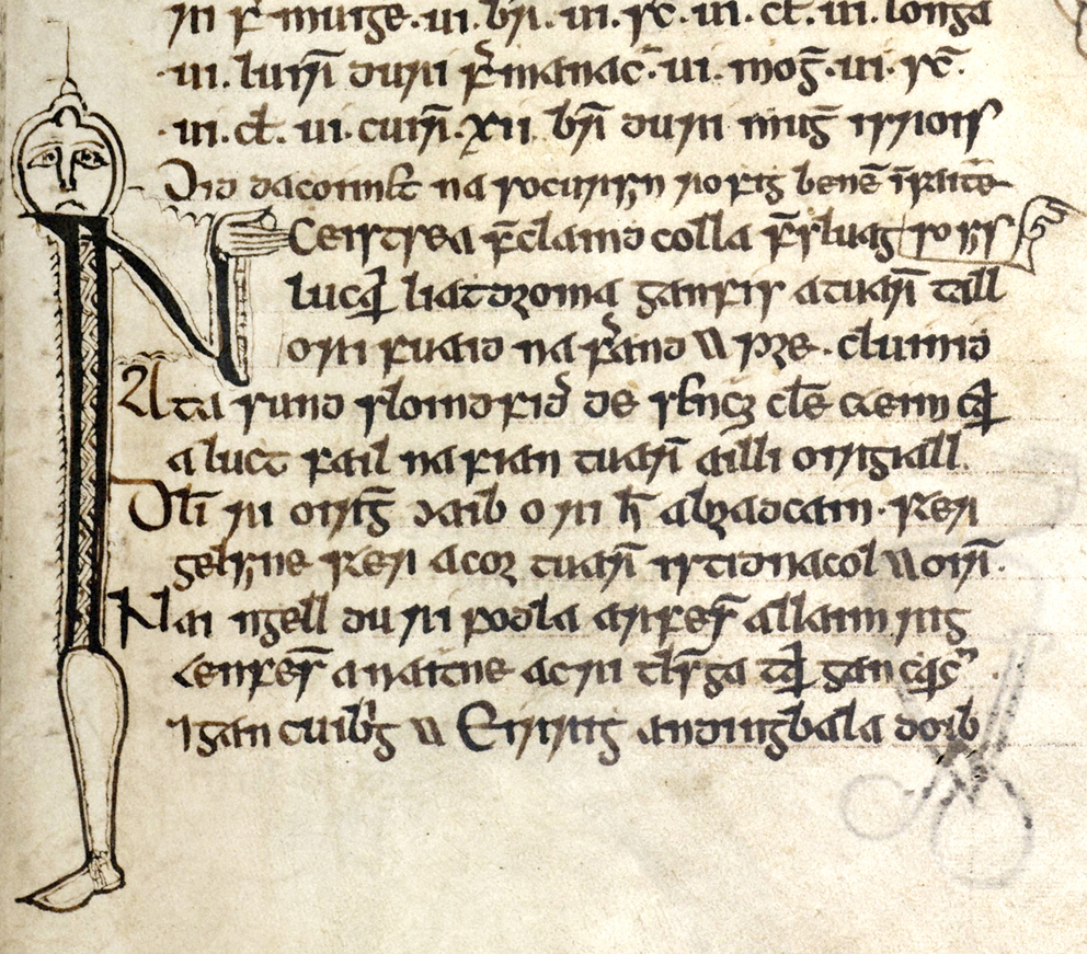
while the hand of an anthropomorphic N (fig. 62) points to the start of a section.
2 Decorative Programmes
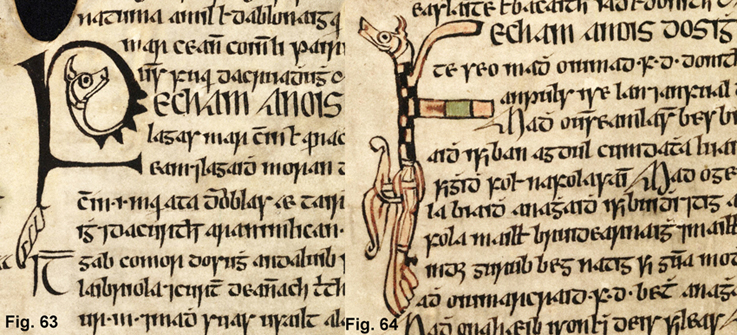
In some manuscripts or gatherings, reader’s aids form part of a thematically unified programme of decoration and reflect elements such as the ornamental terminals of letters and borders. This can be clearly seen in the case of the run-over symbols in RIA 23 P 10 (iii) illustrated in figs 25, 26 above, where the same zoomorphic terminal design is found in the decorated initials illustrated in figs 63, 64.
In the same manuscript, a zoomorphic image on the bottom margin, enclosing the word fein ‘self’ between its ears, is used in conjunction with a line filler to justify the text on the last line (fig. 65).
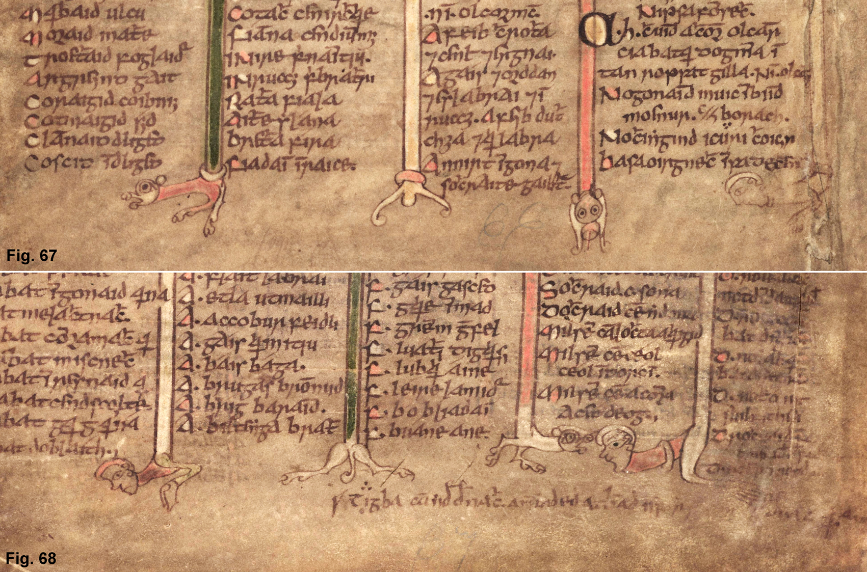
In the Book of Leinster, small human heads marking text run-over (figs 39-41 above) are similar in style to ornamental letter terminals (fig 66),
while terminals on ornamental borders (figs 67, 68) agree stylistically with the anthropomorphic and zoomorphic symbols (figs 32, 39-42 above).
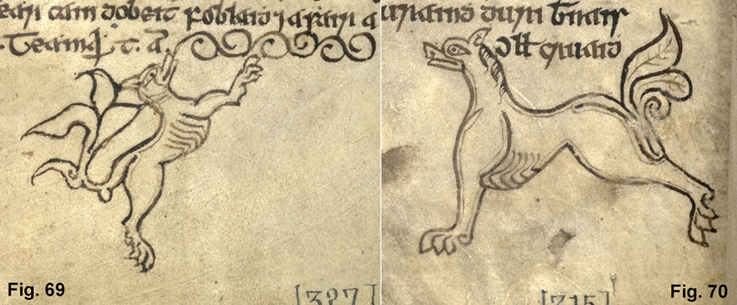
A figure of a dog in the Book of Ballymote (fig. 69) is identical in form to run-over symbols used elsewhere in the manuscript (e.g. fig. 70) but is oriented at a 45° angle on the bottom margin so that his elongated tongue can function as a line filler.
In some cases, the extracolumnar symbols may not be the work of the scribe and may have been added by a specialist illuminator or inserted at a later date, so that it is not always possible to establish scribal authority with any degree of certainty.
3 Manicules
The word ‘manicule’ ‘little hand’ is derived from Latin manicula, a diminutive form of manus ‘hand’. These small, pointing hands can be found in the margins of various types of texts in Irish manuscripts (and later in early printed books) to draw attention to corrections, additions or matters of interest to scribes or readers (fig. 71). As well as highlighting specific matters of textual or codicological significance, they provide evidence of Ireland’s connection to a wider, European scribal tradition.
As noted by William Sherman, manicules have generally been overlooked in manuscript studies: ‘But of all the symbols used by Renaissance readers … the most interesting and least studied must be the small pointing hand … that so often served to mark noteworthy passages. Between at least the twelfth and eighteenth centuries, it may have been the most common symbol produced both for and by readers in the margins of manuscripts and printed books. The margins of Renaissance texts are littered with severed hands, frozen in gestures that cannot fail to catch the eye.’ (William H. Sherman, Used Books: Marking Readers in Renaissance England (2009-10), 29)
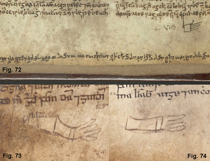
The distinguishing feature of a manicule is the pointing forefinger, which draws the reader’s eye towards a particular item of text. This function of the index finger has been observed as early as the 7th century by Isidore of Seville in his Etymologiae, an encyclopedic work which was regarded by medieval Irish scholars as in culmen ‘the pinnacle [of learning]’. In a section on the fingers, Isidore associates each digit with a particular role, stating of the forefinger that: Secundus index et salutaris seu demonstratorius, quia eo fere salutamus vel ostendimus (Etymologiae XI.i.70), ‘The second is the index finger (index), which is also called the ‘greeter’ (salutaris) or ‘pointer’ (demonstratorius), because we greet someone (salutare) or point something out (ostendere) usually with it’ (The Etymologies of Isidore of Seville, Barney et al (2006), 235). Although some manicules in Irish manuscripts are drawn in a crude or abstract style or even lack the distinguishing feature of the extended forefinger (e.g. figs 72, 73, 74 below), they still manage to attract the reader’s attention.
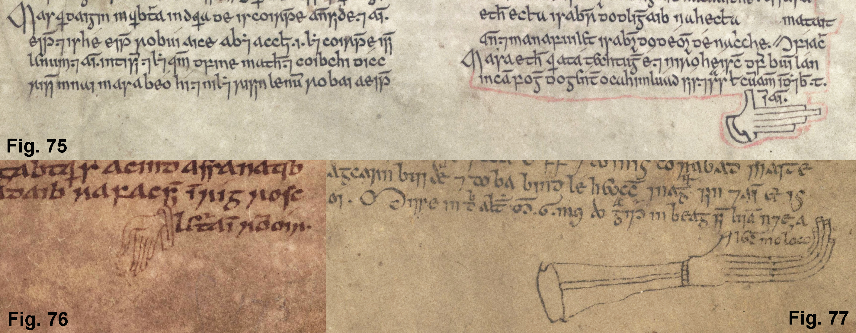
Manicules are to be distinguished from hand-shaped run-over symbols in the bottom margins of manuscripts. The contrast in form and function can be seen clearly by comparing a selection of run-over symbols (figs 75, 76, 77) with a manicule in the bottom margin of Oxford, Bodleian Library, MS Laud 610 (fig. 78). The latter points towards a maginal entry by the scribe, Sighraidh Ua Maíl Chonaire who, while working on the restoration of the manuscript, complained about the quality of his materials: … Sighraidh do graiff sin le drochaidmib ‘ … Sighraidh wrote this with bad materials’.
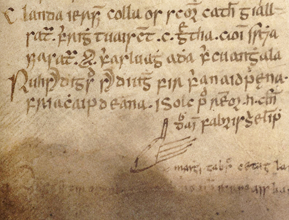
The unidentified scribe of NLI G 7 (fig. 79) has a similar complaint about his writing materials and this is also highlighted by a manicule, which appears to be holding a pen: Is olc pend remor hui Cenndubhain … ‘The thick pen of Ó Cenndubháin is bad …’.
In Egerton 88 (fig. 72 above), an abstract manicule by a later hand is accompanied by the abbreviation N.B (nota bene), drawing the reader’s attention to a lengthy colophon which begins in the middle of the last line and runs into the bottom margin, where it is written upside down.
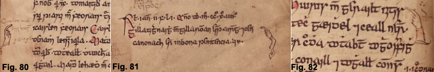
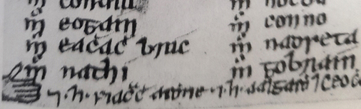
Despite its popularity in the European scribal tradition, the manicule is a relatively uncommon reader’s aid in Irish manuscripts. Annals are the richest source, since scribes and readers would naturally be inclined to highlight dates or events of particular significance or of personal interest to themselves, as well as drawing attention to textual matters. Manicules in the copy of the Annals of Ulster in Oxford, Bodleian Library, MS Rawlinson B 489 (figs 80-82) demonstrate a variety of design features such as ornate cuffs, sleeves and extended arms.
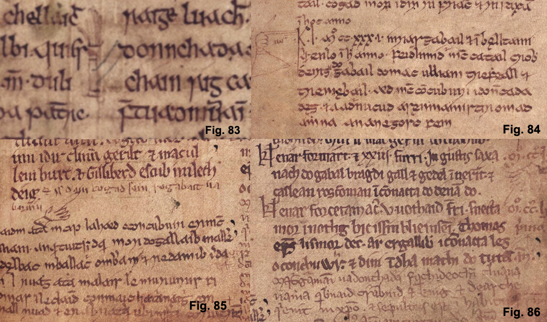
Three of the four manicules in the Annals of Inisfallen in Oxford, Bodleian Library, MS Rawlinson B 503 (figs 83-86) are written in a hand closely connected with Anglo-Norman hands (ff 45 va, 48 ra, 48 rb).
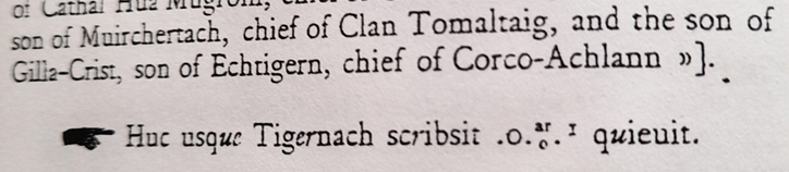
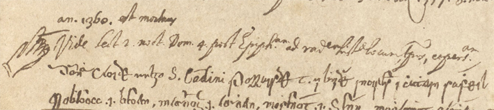
In the copy of the Annals of Tigernach in Oxford, Bodleian Library, MS Rawlinson B 488 (fig. 87), a manicule marking a significant item of text in the first section of the manuscript is reproduced in the printed edition (fig. 88), which is not standard typographical practice.
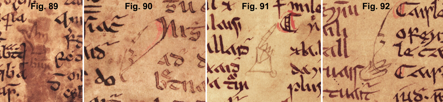
There are four intracolumnar manicules in the later sections of this manuscript (figs 89-92).
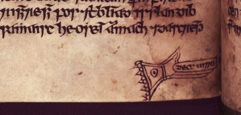
Manicules are found in a variety of other genres such as legal, linguistic, medical and literary sources. The example in fig. 71 above has been added in the margin of the legal tract Bretha Éitgid and is somewhat unusual in its orientation, since it points in an upwards direction towards an addition in the upper margin which is to be inserted into the main text. It is located directly beside the line into which the text is to be inserted, while the marginal text itself and the exact point of insertion within the column are marked by a pair of distinctive, matching reference marks. A manicule in Oxford, Bodleian Library, Rawl. B 506 (fig. 93) indicates to the reader of a fragmentary legal tract on livestock values that there is a chasm in the manuscript. The design of this symbol is also noteworthy in that all of the fingers are extended, although the forefinger is given prominence by being depicted as slightly longer than the middle finger. It also differs from other manicules in having an instruction to the reader (decc uirri ‘look at it’) written on a text box or banner which is superimposed on the forefinger and middle finger.
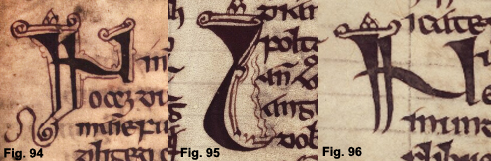
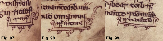
The trefoil design on the ‘cuff’ of the hand is of codicological significance, since it agrees stylistically with elements of the overall programme of decoration, such as the ornamentation on letter terminals (figs 94-96), run-over symbols (fig. 97-99) and text borders (fig. 100). In his Catalogue of Irish language manuscripts in the Bodleian Library at Oxford and Oxford College Libraries (2001, 222), Brian Ó Cuív notes that the marginal additions in this manuscript generally seem to be in the same hand as that of the main text, an unidentified scribe writing for Brian Mac Aodhagáin, who died in 1390. The ornamentation on the manicule suggests that it was produced by the same scribe and that he was aware of the lacuna in his exemplar. Generally, however, it is not possible to establish either the provenance or date of manicules since, like text run-over symbols and other marginal items, they can be added at any time by scribes or readers.
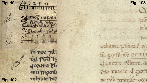
Manicules from a variety of manuscripts and genres are illustrated below: linguistic (Auraicept na nÉces figs 101-102 Book of Ballymote, fig. 103 NLI G 53);
religious (Smaointe Beatha Chríost figs 73-74 above; Martyrology of Donegal fig. 104);
genealogical (fig. 105);
medical (Aphorisms of Hippocrates fig. 106);
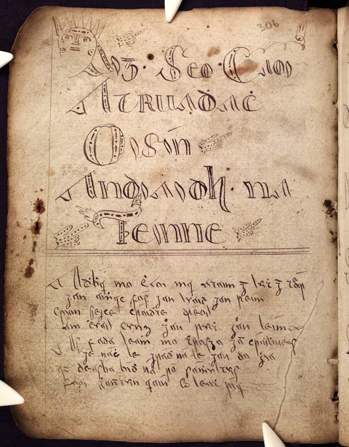
miscellaneous notes (fig. 107). In Mount Melleray MS 6 (fig. 108), a 19th century paper manuscript containing Fíanaigecht material, multiple manicules are used throughout as decorative features to highlight the titles of texts, demonstrating both continuity and innovation in their use by later scribes.
Surprisingly, there is no single term for the device in modern manuscript scholarship, where it is referred to variously as ‘pointing hand’, ‘digit’, ‘fist’, ‘hand’ or ‘index’. The word ‘manicule’ itself, given its derivation from the Latin word for ‘hand’ (manus), would seem to be an entirely appropriate term. Despite the lack of consistency in modern terminology, the manicule symbol survives to the present day in the international encoding standard known as Unicode and is used in a wide variety of functions such as in directional signage, to draw attention to online and physical text and images and even as the link pointer icon on the Google search engine.
The rise of digital technologies and online publishing means that manicules, emojis and other images can easily be inserted into the body of text, bringing us once again to a stage where the boundaries between text and image have become fluid and where we still have something in common with our medieval scribes and their manuscript culture.
©Text and images compiled by Roisin McLaughlin, School of Irish, Celtic Studies and Folklore, University College Dublin.